Issue #86: Visualizing the Georgia Runoff
The 51st Seat
On Tuesday night, Democrats secured their 51st Senate seat with Senator Raphael Warnock’s Georgia runoff victory. In light of this big win, I wanted to offer up a few maps to highlight how this victory happened. Far more detailed analysis is coming and already done by people who know Georgia politics the way I know Florida, so I dare not offer more than cursory glance.
Heading into the Runoff
Before the runoff vote even took place, it was clear that Senator Warnock’s opponent, Herschel Walker, was a flawed candidate. He was a bad campaigner and had a massive litany of personal scandals. You know, threatening to kill his ex-wife, ignoring his kids, and paying for multiple abortions for mistresses. You know - small stuff!
On top of this, the Trump brand has clearly been on the decline in Georgia. The ex-President’s efforts to take down Governor Brian Kemp and Secretary of State Brad Raffensperger for their unwillingness to steal the state for him backfired. Kemp easily destroyed his primary challenger - ex Senator David Perdue. In the SOS race, Raffensperger bested Congressman Jody Hice in a much bigger win than expected.
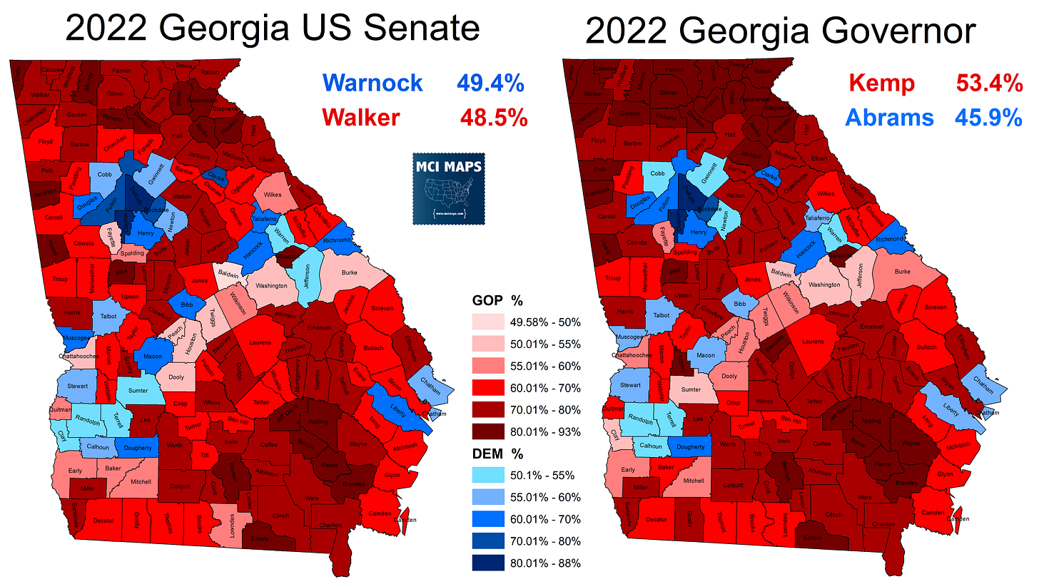
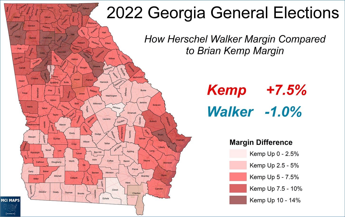
In the general election, Georgia Republicans faired well. Their gerrymander of the Atlanta districts successfully forced out one Democratic seat; meanwhile the GOP slate won all state offices. The only Republican to lose was Hershel Walker - who fell behind Warnock, but since no one got 50%, a runoff was needed. Compare this to Kemp’s 8% win over Stacy Abrams.
Walker's biggest issue were underperforming in suburbs. Walker especially underperformed Kemp in the GOP-rich exurbs of Atlanta. Overall the entire North end of the state was bad for him as well as the Savannah region.
Heading into the runoff, this underperformance with Republicans led GOP leaders to make major pushes to unify the Republican party. With just 4 weeks to a runoff, the GOP got Brian Kemp on board to try and carry Walker over the finish line. However, with Senate control not on the line, motivating Republicans to show up for a flawed candidate was not going to be easy.
How well or poorly Republicans did in getting their side out will need some clarification once the voter files are released. In the meantime, however, we can make some estimates.
The Runoff Results
I should note right off the bat these results are not finalized and are as of 5pm Wednesday. More raw votes may still need to be reported (we were getting updates the next day through the afternoon). As of now, this is what I am seeing.
First, here is how Warnock’s 1% General Election win looks compared to his near-3% runoff win.
In terms of raw vote margin, its is very clear how powerful the Atlanta metro region is. While Senator Warnock racked up MASSIVE margins in Atlanta, Walker was counting out all those rural counties + the exurbs to pull him to victory. It wasn’t enough - as Warnock currently has a 97,000 vote margin.
Before we look at trends between the two votes, lets note how turnout looked. As of writing, the total votes cast was 3.5 million, which is down from the 3.9 million of the general. That said, this is still a solid 90% of the electorate returning! The reduction of votes cast was strongest in the North Georgia area; covering both parts of Atlanta and the conservative exurbs and rurals.
Of course what is also critical here is who within a county isn’t showing up. A county drop could have been disproportional to one party-aligned side, after all. Precinct data and voterfile data will help clarify this further.
How to Visualize the Swing
In terms of swing, there are two ways to look at how Warnock’s vote shifted. One is raw vote and one is percent. First let us look at the raw vote. Why? Because campaigns do.
In the first round, Senator Warnock led by 38,000 votes over Walker. The goal for the runoff was simple, don’t let that lead be erased. Senator Warnock could get fewer votes in the runoff - as long as Walker lost some as well. A runoff strategy, especially for a short term campaign, is overwhelmingly based on simply getting your side out again.
So how did the raw votes shift. Well Warnock did lose votes. He got 130,000 FEWER votes than he did in November.
But that was ok for him! Because Walker got 190,000 fewer votes!
The result was Warnock’s margin actually increased by about 60,000. I mapped this 60,000 NET shift by county. Across almost every county, Warnock improved his raw vote margin. Only in the Democratic core of Atlanta did his raw vote margin drop.
This Atlanta drop was inevitable due to turnout drops in the city. While that might give some democrats anxiety - it shouldn’t. These drops not large, and easily made up across the rest of the state.
The Warnock campaign expected some drop in Atlanta. The short campaign cycle plus the crazy long lines (yes GOP efforts to suppress drop boxes and the like) meant it would always be down a bit. The Democrats made up for it though in the Atlanta exurbs, where I venture many Republicans stayed home. In the rurals, Warnock made small improvements. This could be as small as going from losing a rural county by 300 and instead losing it by 240. Again, that is a NET 60 vote improvement. That adds up. The Walker campaign could not afford these small vote shifts in the rurals.
Now, here is the vote % shift. This tells a slightly different story. Warnock improved his margin across most of the state, including Atlanta proper.
His marginal improvement in Atlanta does matter - as it kept it from shedding more raw votes. Had he lost % ground in Fulton, that raw vote drop would have been much higher. Now, while the % map does show Warnock losing ground in the Northern rural counties, their lower turnout still meant that Warnock IMPROVED in terms of net votes cast.
So different maps can tell different things. Coming from the world of campaigns, the raw vote shift is much more informative to me. Though I like providing multiple visuals to give readers a fuller picture. But if anyone follows me on twitter, they saw me and other debate what map styles are best. In general campaign world favors the raw vote swing while academic side favors the percent swing. Again I am a campaign guy first and foremost.
This is definitely an issue I think about alot. How to map shifts. With a runoff 4 weeks after a first round, I think raw vote is a better direct comparison (especially when turnout remains a decent chunk of the first round). That said, when I was digging into Florida 2020 breakdowns, I made this map. Both are swings, one is percent, one is raw vote.
So in the bottom left is how Biden and Clinton margin % changed. Notice how Biden improves over Clinton across the Southwest coast. Now look at the raw vote swing - all Trump improvements.
The answer for this is simple, higher number of voters casting ballot. Even though Biden made marginal improvements in these red counties, the higher turnout meant that Trump actually netted more votes. Meanwhile, even as Biden narrowly lost ground in Orange - he racked up over 20,000 NET votes more than Clinton thanks to population growth. These raw vote swings dictate the election results.
Both of these images tell a story about Florida - and yes both matter. Often % and vote shifts are locked together - but not always. We see that in Georgia.
In conclusion - I think both styles are important and valuable. No visualization is useless. They tell a story of an election.
As President Bartlet said.


