Issue #140: Precinct Maps from Kentucky
Detailed looks at the Beshear win
Last week, Andy Beshear, the Democratic Governor of Kentucky, won re-election. I covered the preview of that race here, and an initial look at his win here. Today’s post is largely to organize the precinct maps I’ve created of the race, along with some further analysis of Beshear’s impressive 5 point win in a deep-red state.
Visualizing the Beshear Win
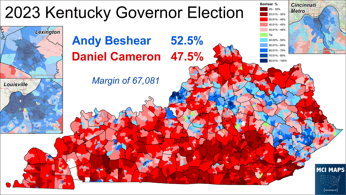
The first map I of course had to make was the precinct results of the win. Beshear took the state by 5%, or 67000 votes. The precinct map is below.
The precinct map highlights not only highlights how Beshear did well in the eastern coal fields, but where those fields end and the state’s ancestral-Republican southeast begins. The map also shows many small Beshear pockets, often in the lone towns in otherwise very rural counties.
Beshear improved across a vast majority of the state. A precinct-level swing map shows specific pockets of Beshear decline, namely along the southern border and in the northeast. As I discussed in my initial reaction article, the biggest swing to Beshear was in the eastern mountain that suffered catastrophic flooding last year; which killed over 40 people and swept away property across several counties. The Beshear admin received glowing praise for its post-disaster outreach.
The flooding shaped politics in much of the region. In my 2022 Pike County article (issue #137), I highlighted how Democratic Coroner candidate Kevin Hall resisted the red ted that swept out many in his party because he was praised for his flood-recovery efforts.
Now that Beshear win map still has a great deal of red in it despite it being a 5 point margin. This of course highlights the classic case of land not voting. To better highlight this, I created a vote density map. This map takes the raw vote margin and divides it by the size of the precinct. Lighter colors indicating fewer votes per square mile, while darker colors mean a denser cluster of votes.
The map shows many deep blue pockets, especially in Lexington, Louisville, and the Cincinnati suburbs. Cameron, meanwhile, only had a few area where he had dense clusters of votes. Most of the GOP precincts were low-total, rural, spread out voter pockets.
Lets compare that to a density map from the 2022 Kentucky Senate race, which saw Rand Paul easily win re-election over Charles Booker. This map shows a much greater degree of Republican hotspots.
The Senate map shows Rand Paul winning the exurbs and suburbs around the cities, wracking up dense pockets there. It also shows Paul doing much stronger in rural communities, allowing more clusters of dark red even in lower-populated areas.
Looking at Turnout
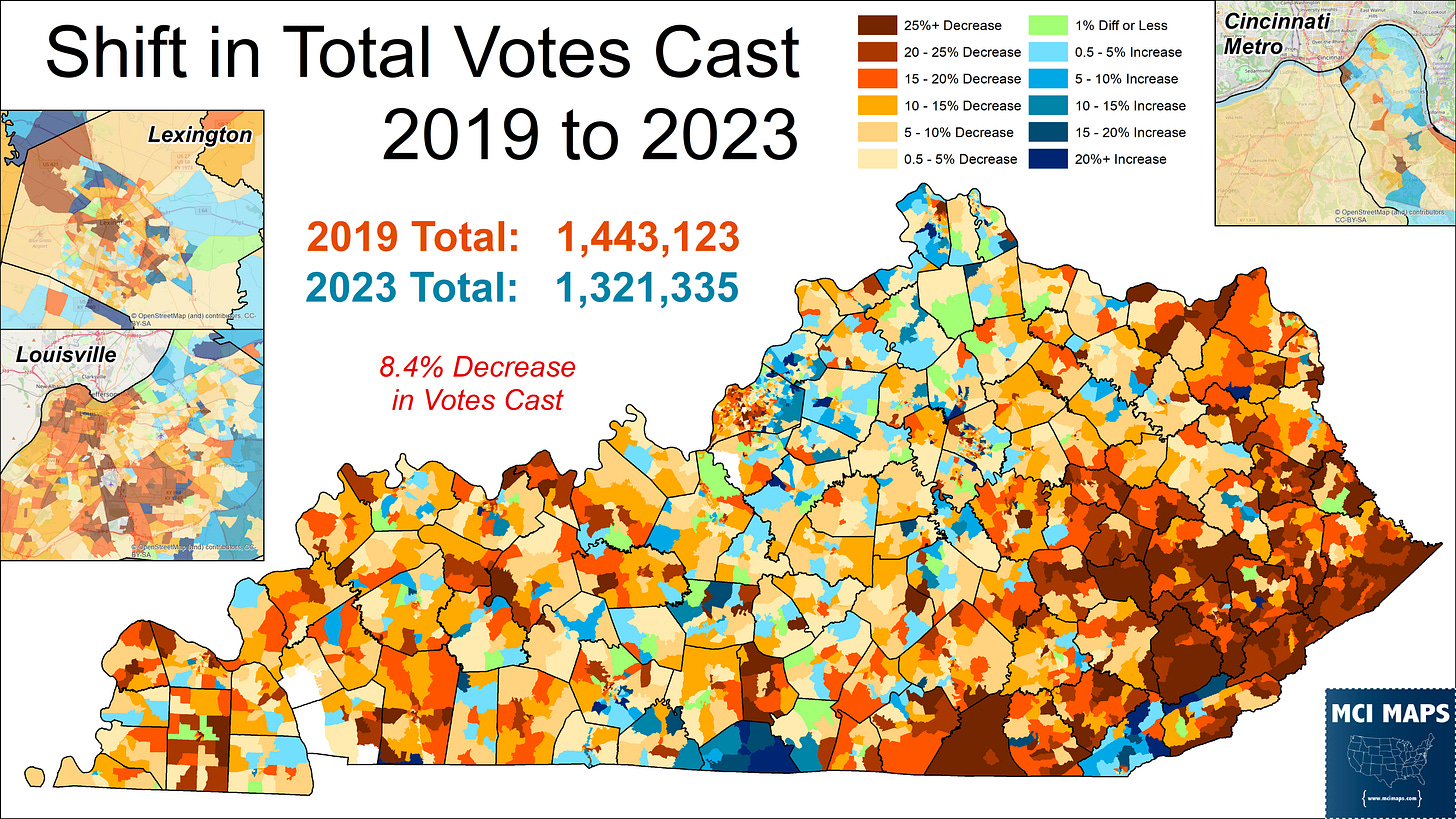
In my initial reaction article, I pointed out that 8% fewer votes were cast in 2023 compared with 2019. The county-level data showed turnout was far lower in the eastern coal counties, which have been losing population consistently as jobs dry up in the area. The precinct version of that map can be seen here.
The eastern coal fields really stand out for how much the vote dropped. This will only continue with time, as these regions have little economic drivers to bring people into the area. Turnout drops were far lower in the cities, though they were still there. Turnout was down in the black communities of Lexington and Louisville, but that drop was FAR less than in the conservative rural towns. For Beshear, the turnout swing benefitted him overall.
Only three counties saw a larger vote vast share. However, no county compared with Monroe, which had a 20% vote increase. Why was this?
It was not population increases, or unusually low turnout from 2019. Rather, the reason was the local drive of a referendum on liquor sales. Monroe was holding a wet/dry referendum to see if the county would become wet. Many Kentucky counties remain dry. The referendum saw liquor sales pass with 54%.
I’ve covered wet/dry referendum’s before, largely in the context of Florida; which still has two dry counties. You can read more about those here.
It might seems crazy to imagine a local measure driving turnout more than major statewide races, but in rural counties like this, those contests can inflame passions far more. The campaign saw church groups oppose while businesses pushed for a YES vote. In a deep red county, it was the issue of introducing liquor that was far more interesting - and it spiked turnout.
Beshear and Abortion
In my election preview, I discussed how Beshear made abortion rights a key part of his re-election message. Beshear highlighted the state’s draconian abortion restriction, which banned abortion except when life of the mother was at risk. The campaign ran many ads highlighting the tragic situations, like this story…….
The Beshear campaign was politically correct in believing abortion would be a winning issue for them. As I wrote about earlier this year, the state rejected a measure that would aimed to strip abortion from the state’s privacy protection.
Beshear’s 5 point win was just a bit better than the pro-choice side in the 2022 campaign. So how did Beshear do compared to the NO side? The precinct map shows where Beshear or NO did better.
Beshear did far better in the eastern coal fields, often by massive margins. He likewise did better in the western coal counties. However, abortion rights did perform better in many rural communities, but especially in the exurbs and suburbs.
While the coal fields were a common site of Beshear over-performance, this map of Jefferson County also highlights another key demo Beshear did better with; black voters. The Beshear > NO pockets are largely based in the area’s black communities.
The Jefferson map also highlights the suburban strength of abortion rights, with Beshear largely doing worse, albeit modestly, outside of the urban core.
Below you can see a map showing how precincts voted in the respective races. This map further highlights the differing coalitions, with precincts surrounding the major urban centers backing Cameron while voting NO, while Beshear has many of the pro-life coal precincts in the east.
One additional county I wanted to highlight for a comparison is Rowan. This county, located in the eastern coal fields, is different from its neighbors thanks to the presence of the City of Morehead and Morehead State University. The county voted for Beshear by 21 points, while it voted pro-choice by 15. That abortion margin was far more pro-choice than its neighbors.
The map shows Beshear doing much better in many rural precincts, but the downtown communities next to the University showed abortion rights do far stronger. Rowan remains a modest-GOP precinct in an area otherwise much more deep-red, and it is the University Presence and town around it that keeps it from slipping further to the right.
Why am I highlighting Rowan County? Well, this county may ring a bell for the hyper-political of you. It was the home of infamous county clerk Kim Davis - who famously refused to issue same sex marriage certificates in 2015, after the practice was legalized. David drew national attention when she was arrested for failing to adhere to court orders. She became a conservative celebrity due to her stances, though eventually licenses would be issued.
Davis may have gotten conservative media love, but her stance did not help her in electoral politics. In 2018, Davis lost re-election as the Clerk of Court to her own deputy; Elwood Caudill.
I wrote in-depth on the Davis controversy and Rowan politics back in 2018. You can read all about that here.
That does it for now on the Kentucky elections. However, it is not the last time I will be delving into abortion politics in the region. I will soon begin to work on the precinct map for the Ohio pro-choice ballot measure that passed earlier this month. With that referendum, we have three states right next to each-other that have voted on abortion rights in recent years.
Once I get Ohio done, I will delve more into the politics of abortion in Appalachia.


Hi Matthew, love this analysis. Would you be able to share your precinct shapefiles for 2022 and 2023? Doing some work for a table in KY.